pantone-landscapes-andrea-antoni-stailtone-stailuan-thechicflaneuse-7.jpg

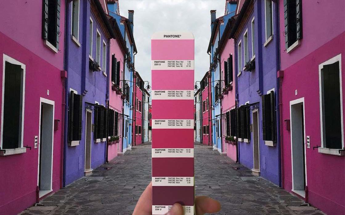
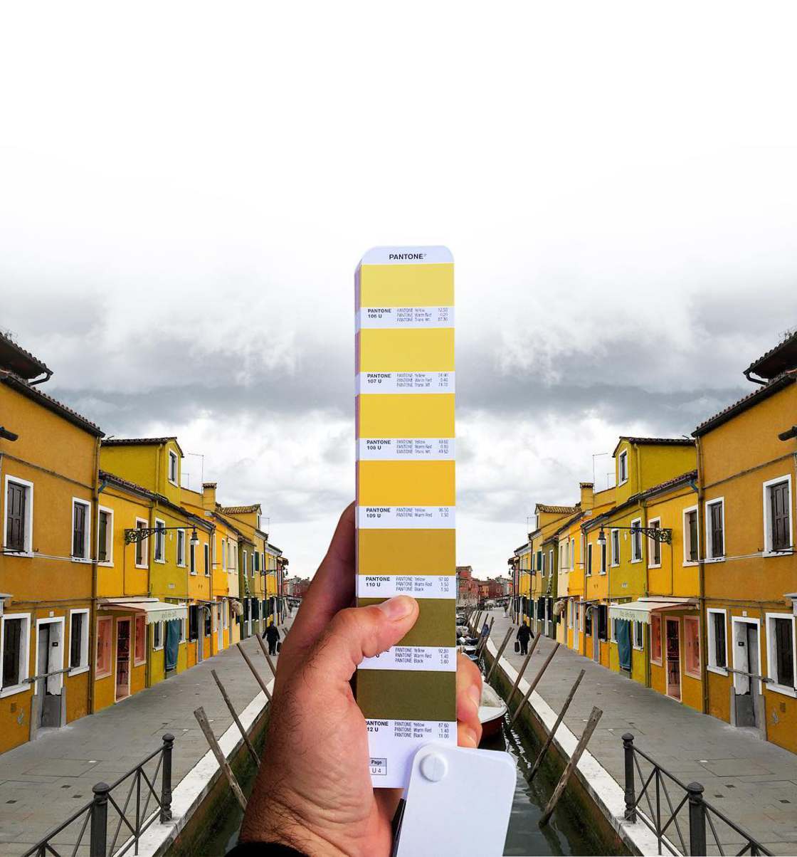
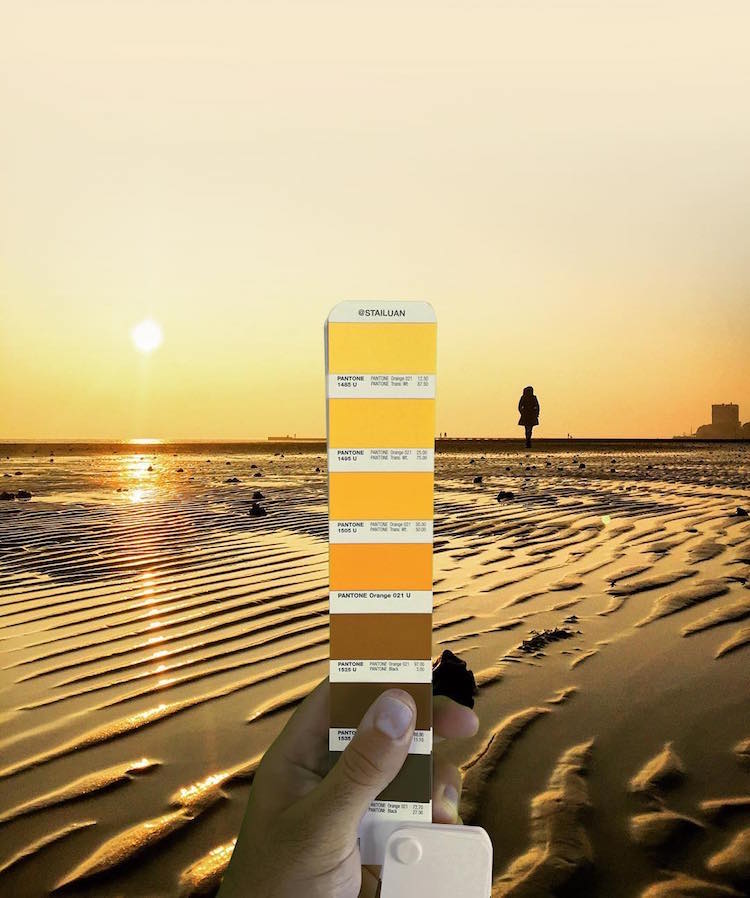
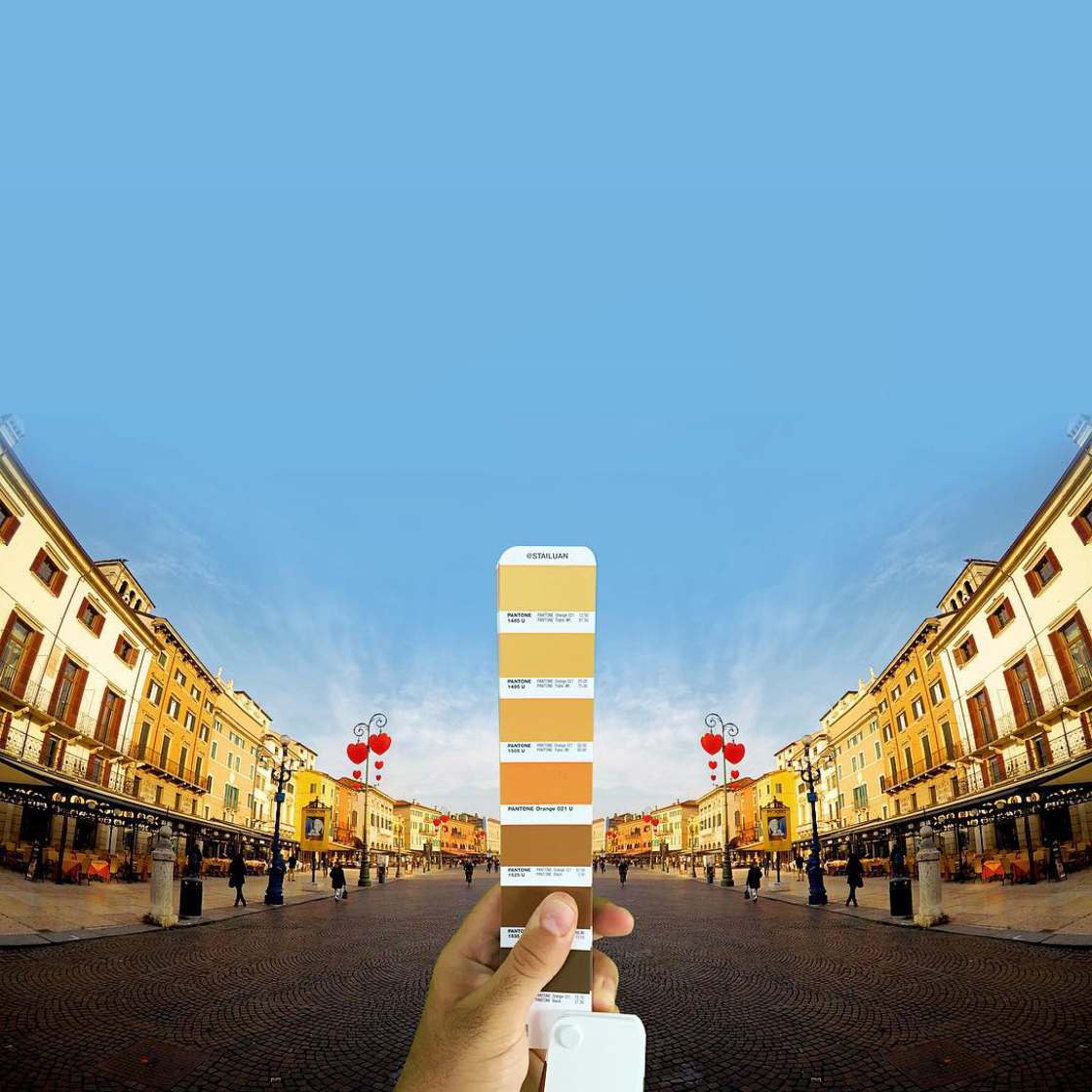
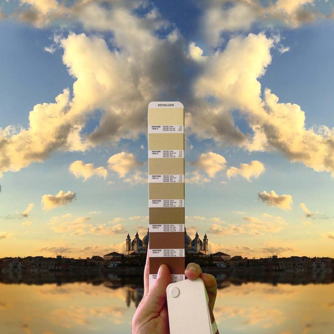
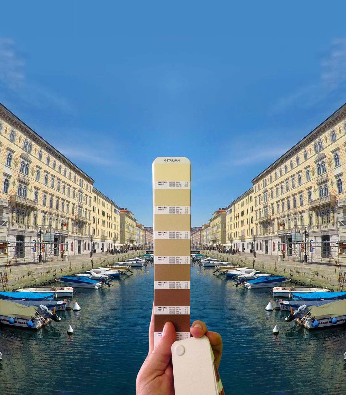
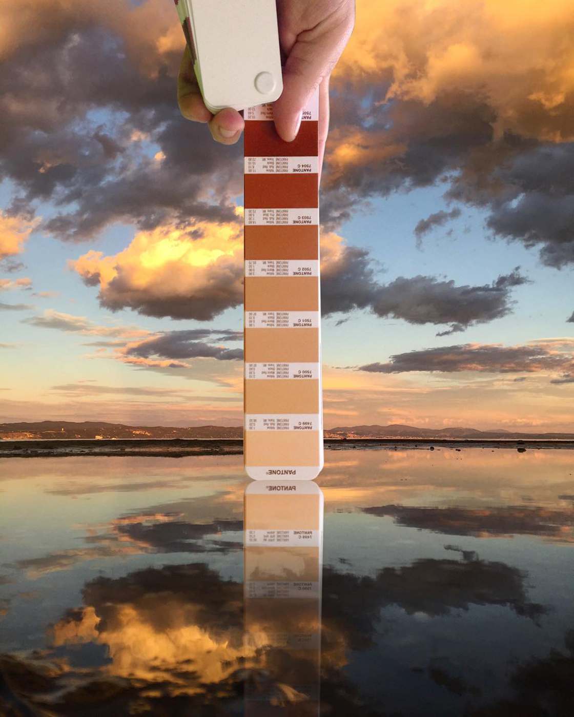
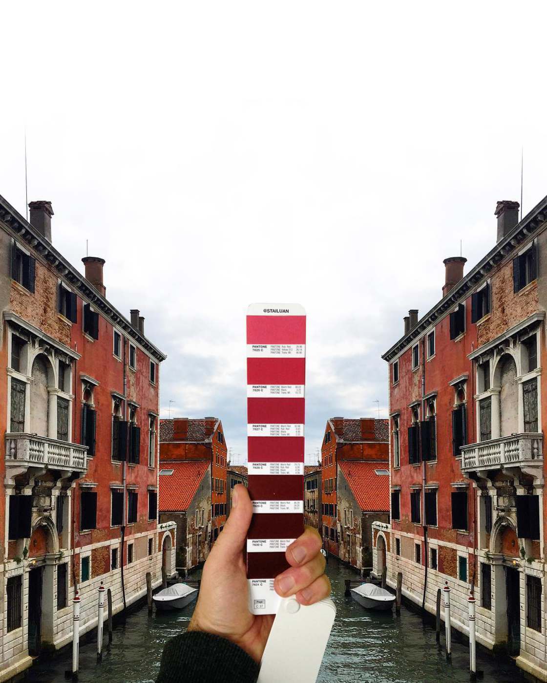
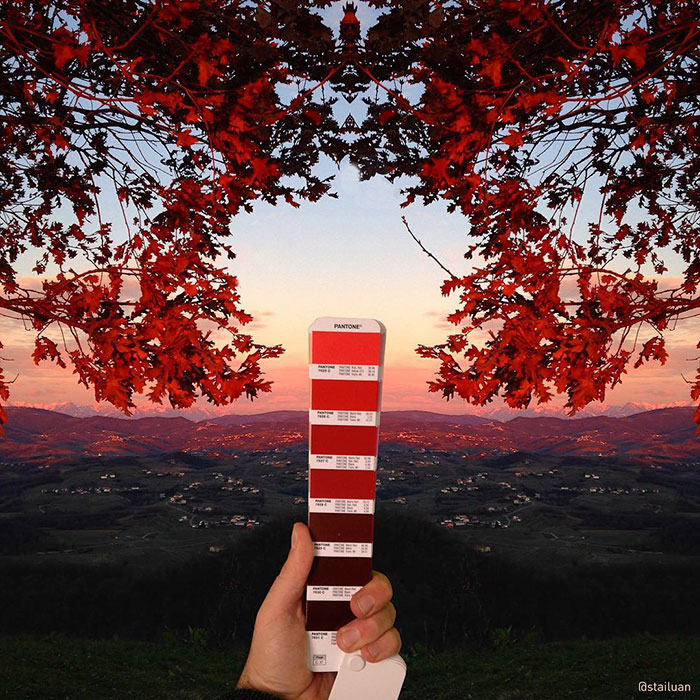
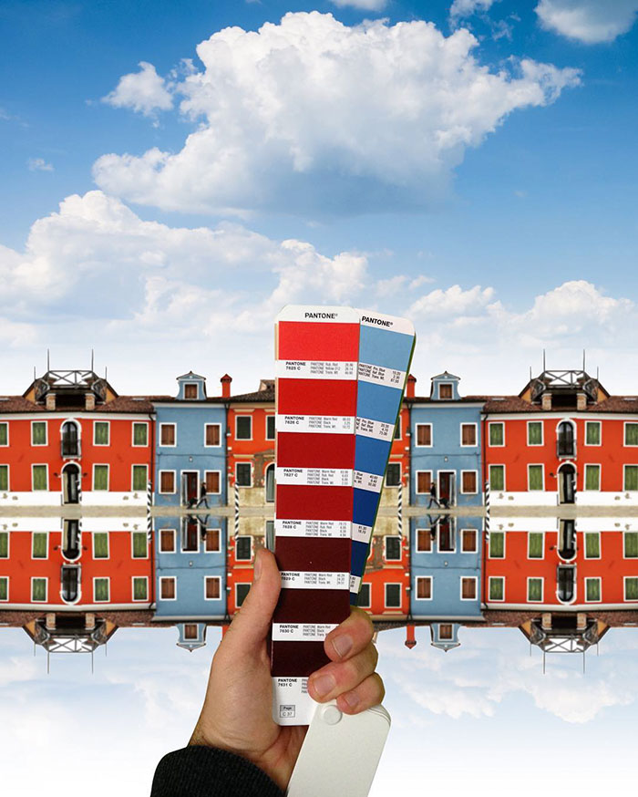
The italian graphic designer Andrea Antoni matches the iconic color-matching system Pantone with gorgeous landscapes of Italy.

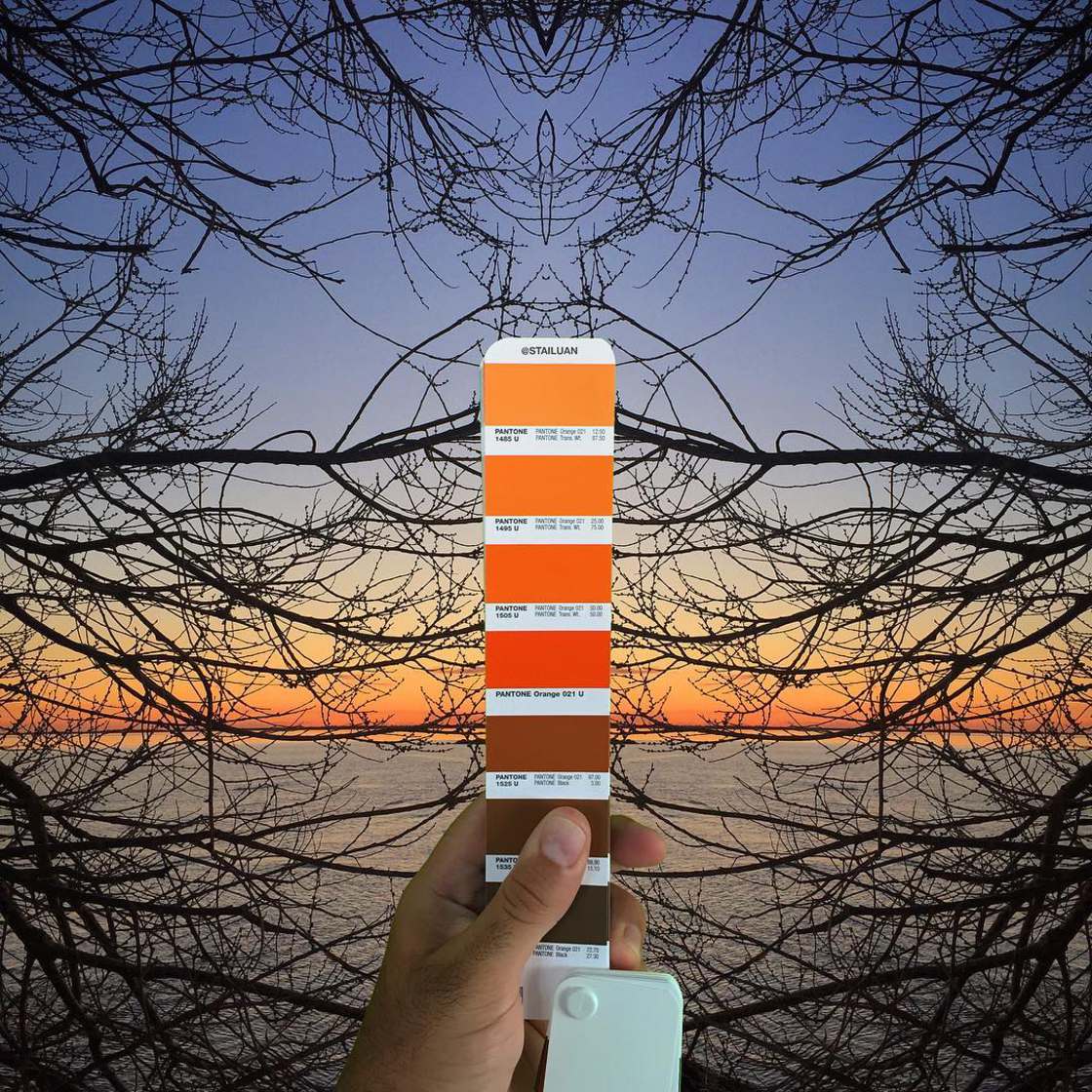
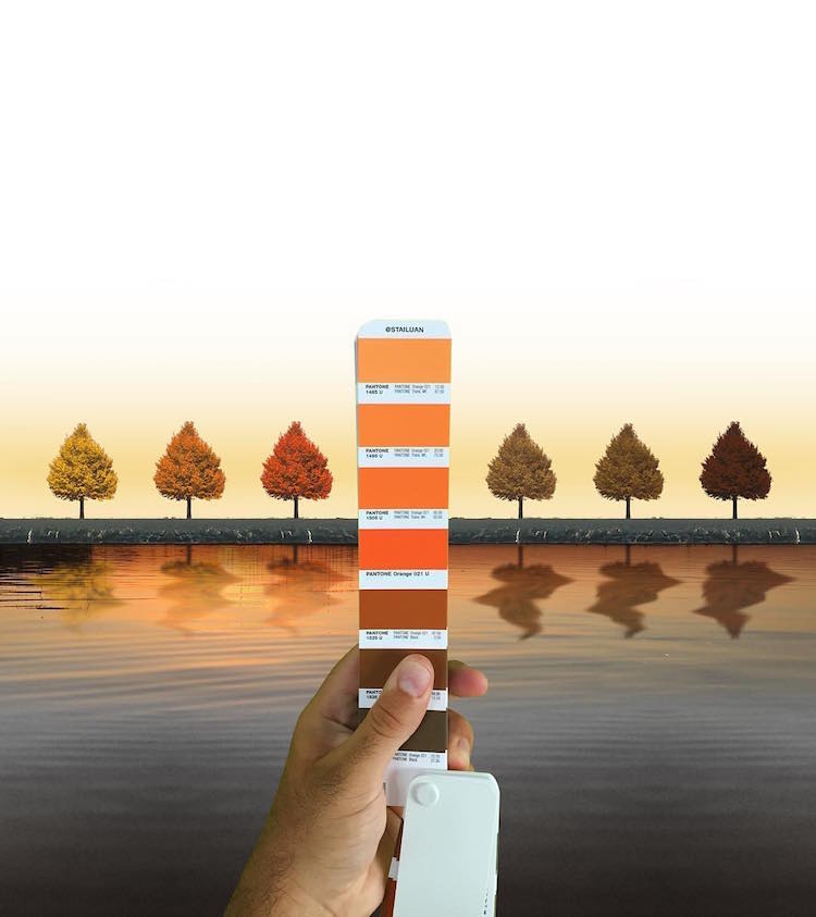
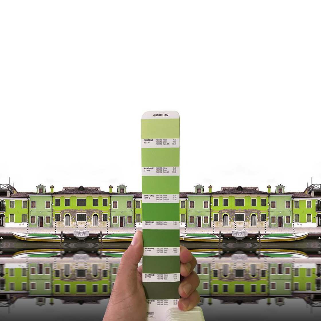
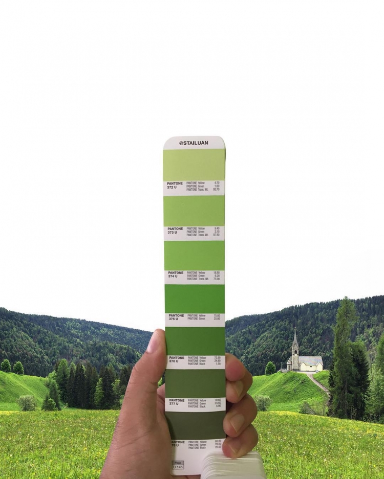
On his Instagram account he shares photos where the hues inside the images are enhanced by paired swatches of pantone scale. In each picture the artist holds up a page from a Pantone fan deck. The project is named “Stailtone” (a mix of his nickname on Instagram @Stailuan and Pantone) in other words the colors that turn around the artist. He started publishing on his instagram account roughly one year ago but the practise of matching pantone, started many years before when the artist was used to pair the sky above his house with the matching Pantone color of the day.

pantone-landscapes-andrea-antoni-stailtone-stailuan-thechicflaneuse-11.jpg

pantone-landscapes-andrea-antoni-stailtone-stailuan-thechicflaneuse-25.jpg

pantone-landscapes-andrea-antoni-stailtone-stailuan-thechicflaneuse-1.jpg

pantone-landscapes-andrea-antoni-stailtone-stailuan-thechicflaneuse-4.jpg

pantone-landscapes-andrea-antoni-stailtone-stailuan-thechicflaneuse-30.jpg

pantone-landscapes-andrea-antoni-stailtone-stailuan-thechicflaneuse-19.jpg

pantone-landscapes-andrea-antoni-stailtone-stailuan-thechicflaneuse-5.jpg

pantone-landscape-andrea-antoni-stailtone-stailuan-thechicflaneuse-29-.jpg

pantone-landscapes-andrea-antoni-stailtone-stailuan-thechicflaneuse-16.jpg

pantone-landscapes-andrea-antoni-stailtone-stailuan-thechicflaneuse-18.jpg


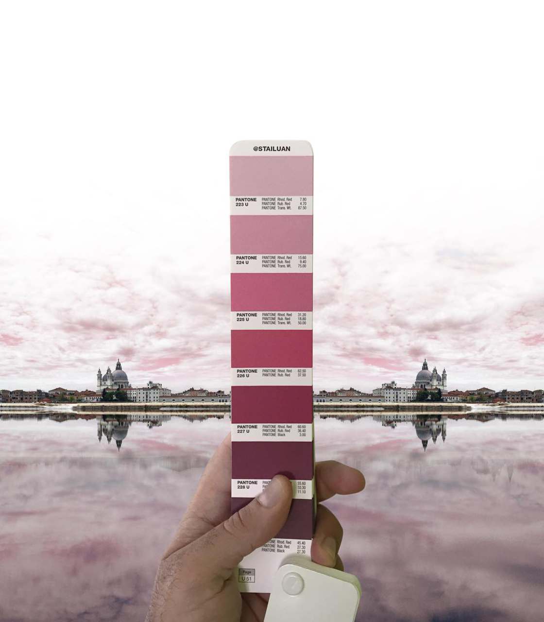
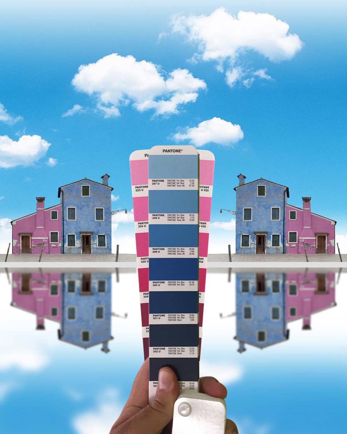
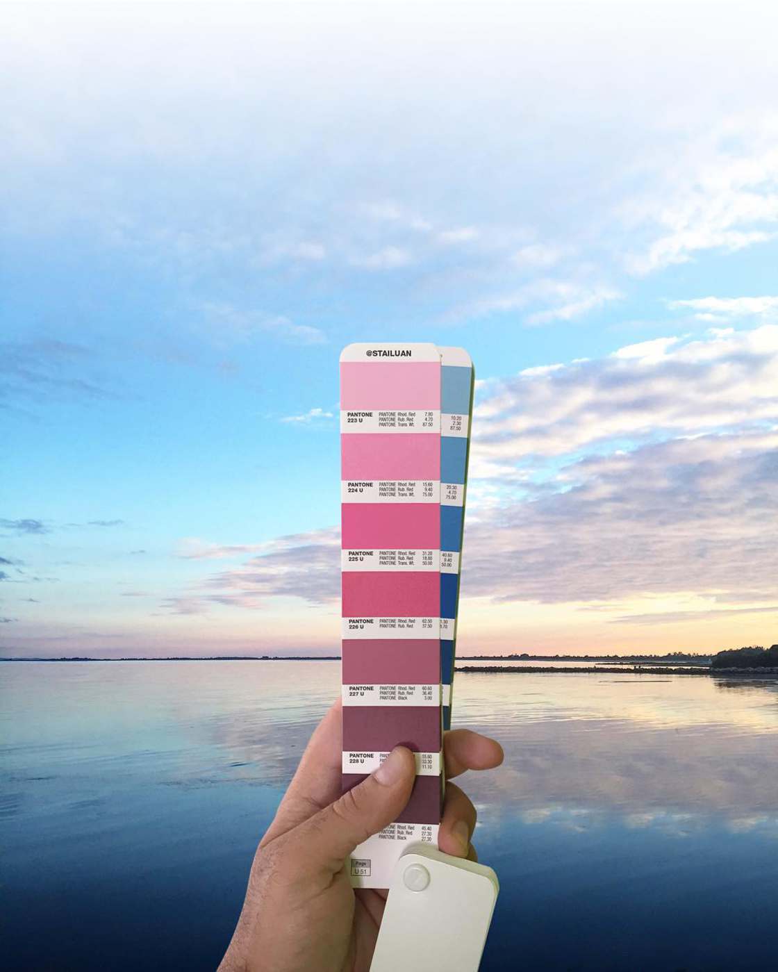
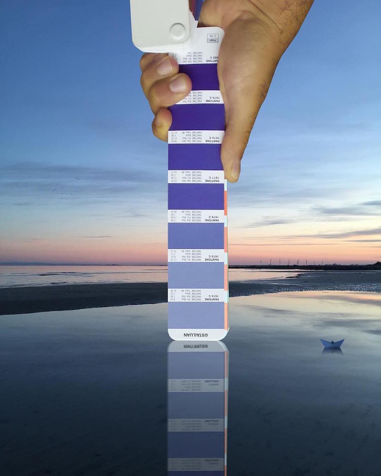
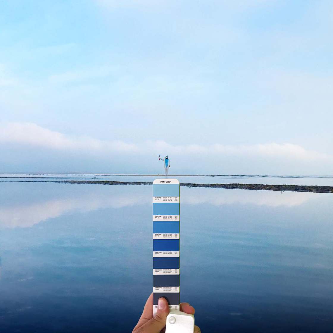
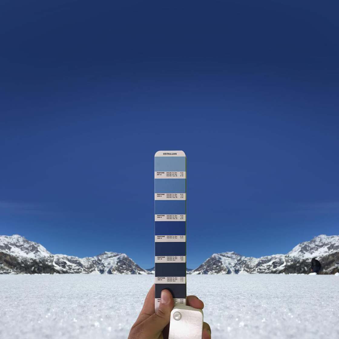
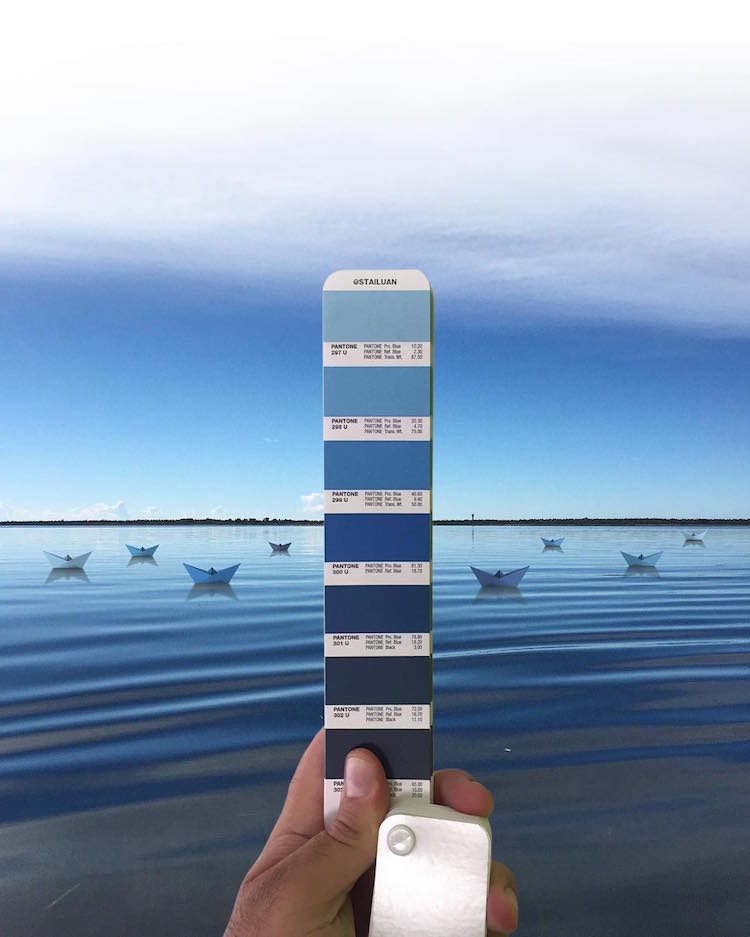
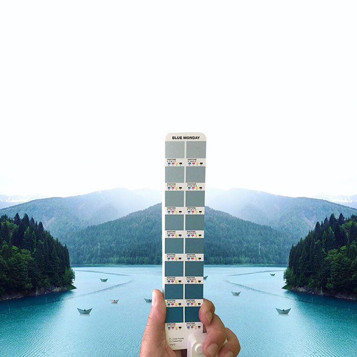
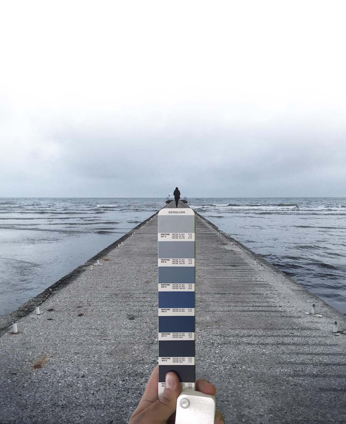
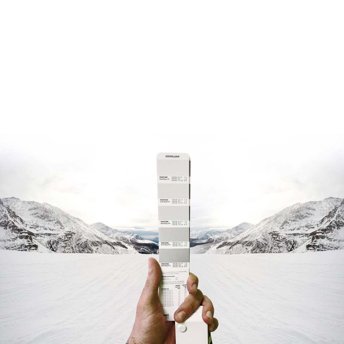
Antoni frequently manipulates his original images sometimes choosing to omit certain color swatches giving more contrast and emphasis to each composition.

Interviewed by Creators he explained:

“The images reflect the way I see the world, or the memory I have of some places. Some show the sensations that these places evoke in me…When I heavily modify the composition, it reflects my memory and the evocations of that particular place to me.”

pantone-landscapes-andrea-antoni-stailtone-stailuan-thechicflaneuse-26.jpg

pantone-landscapes-andrea-antoni-stailtone-stailuan-thechicflaneuse-6.jpg

pantone-landscapes-andrea-antoni-stailtone-stailuan-thechicflaneuse-17.jpg

pantone-landscapes-andrea-antoni-stailtone-stailuan-thechicflaneuse-15.jpg

pantone-landscapes-andrea-antoni-stailtone-stailuan-thechicflaneuse-9.jpg

pantone-landscapes-andrea-antoni-stailtone-stailuan-thechicflaneuse-12.jpg

pantone-landscapes-andrea-antoni-stailtone-stailuan-thechicflaneuse-13.jpg

pantone-landscape-andrea-antoni-stailtone-stailuan-thechicflaneuse-21.jpg

pantone-landscape-andrea-antoni-stailtone-stailuan-thechicflaneuse-24.jpg

pantone-landscapes-andrea-antoni-stailtone-stailuan-thechicflaneuse-8.jpg

pantone-landscapes-andrea-antoni-stailtone-stailuan-thechicflaneuse-3.jpg pantone-landscapes-andrea-antoni-stailtone-stailuan-thechicflaneuse-28.jpg


pantone-landascapes-andrea-antoni-stailtone-stailuan-thechicflaneuse.jpg

“While it is definitely these same places in the pictures, it is also not them; colors have changed, buildings are cut out and presented in different ways. The result is a world that is unreal from one point of view, but extremely true from another. That’s the place of memory; real and recreated at the same time.”

You can see all of Antoni’s Pantone-themed photos on his Instagram account of follow Andrea Antoni on his website or Facebook page.