

Although we often do not notice, colors and their combinations play a crucial role in watching a movie. And this is well known by famous director Wes Anderson that combines particular plots and perfect symmetries, to strong chromatic choices that significantly affect the atmosphere of the films, becoming a determining factor for the very skeleton of the film. The care for the colors is maniacal: the scenes are calibrated and the shades of colors are harmonized as in a painting, combining a precise chromatic intent with each moment. Estranging scenes and harmonic scenes.
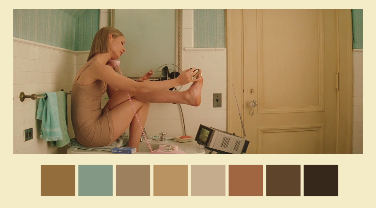
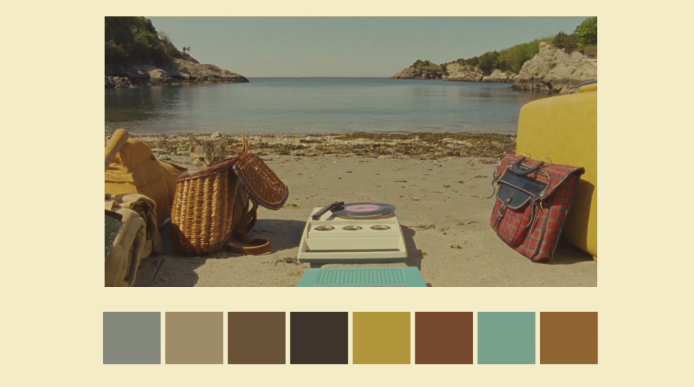
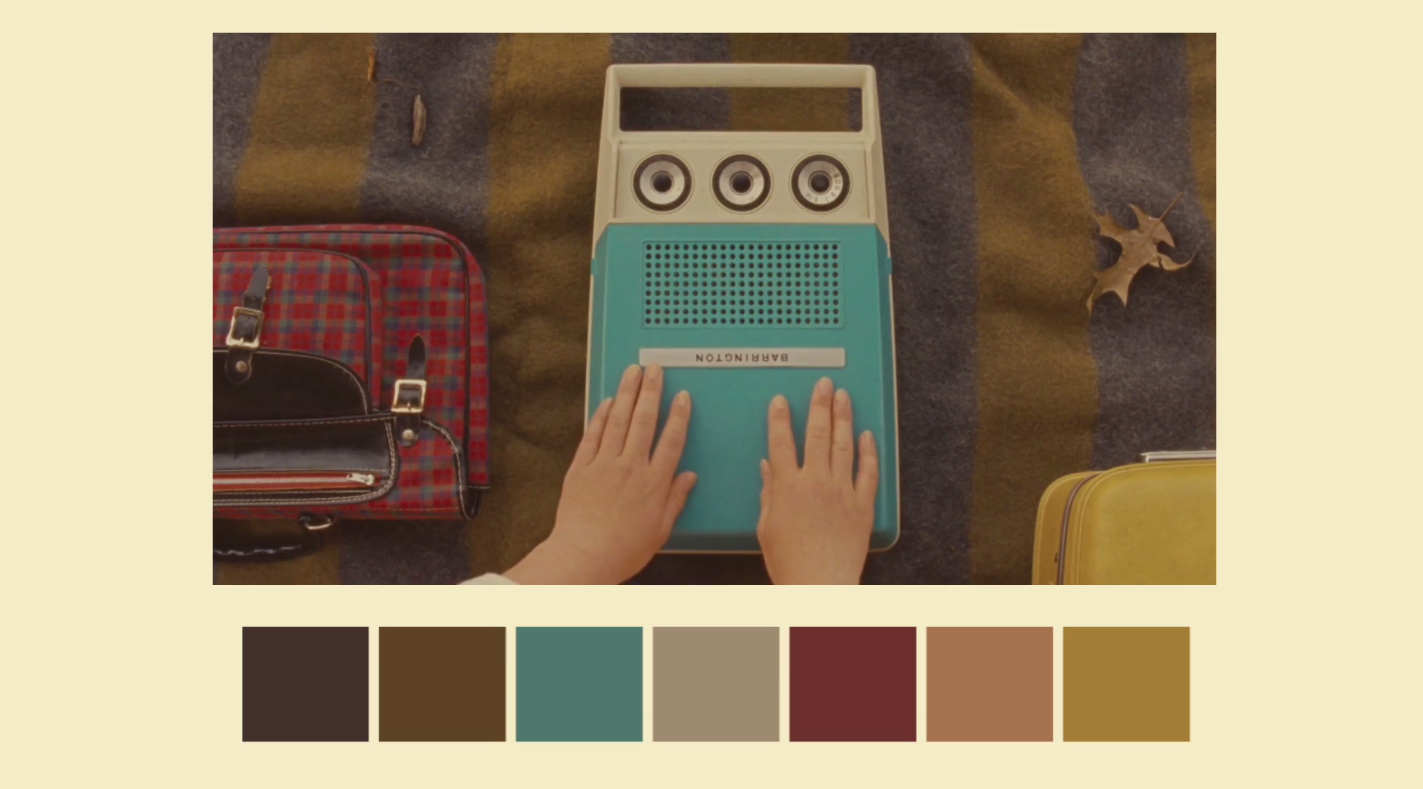
In duly caricatured moments the colors are contrasted with red and violet intense as in The Grand Budapest Hotel. The palette becomes almost monochromatic in Moonrise Kingdom to enhance the deliberately retro effect of the entire film with its delicate and imaginative atmosphere.
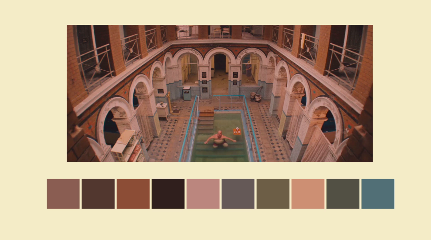
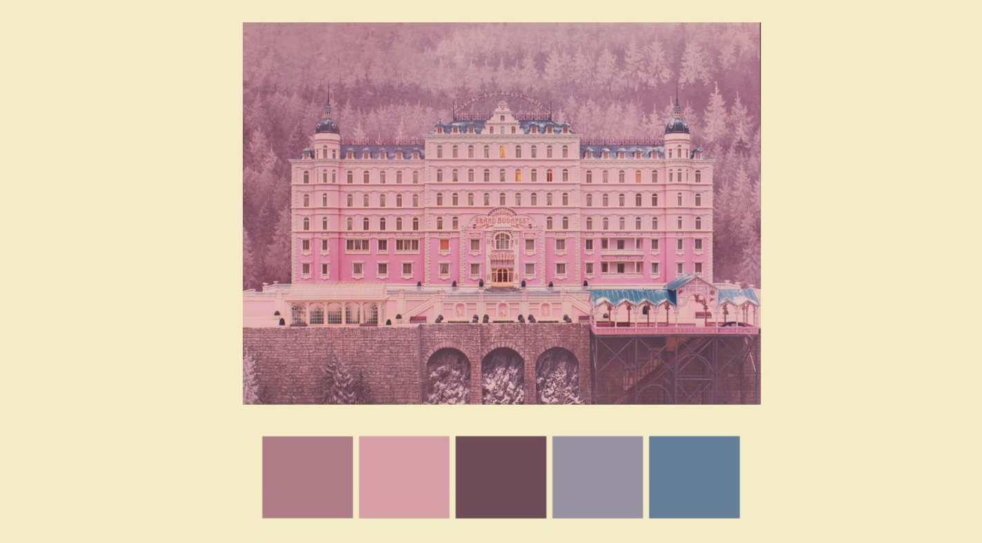
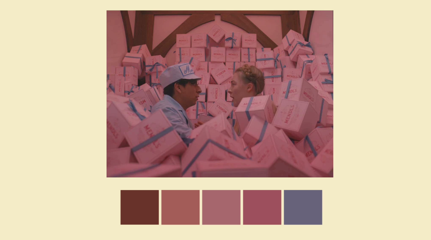
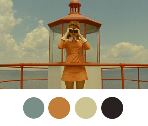
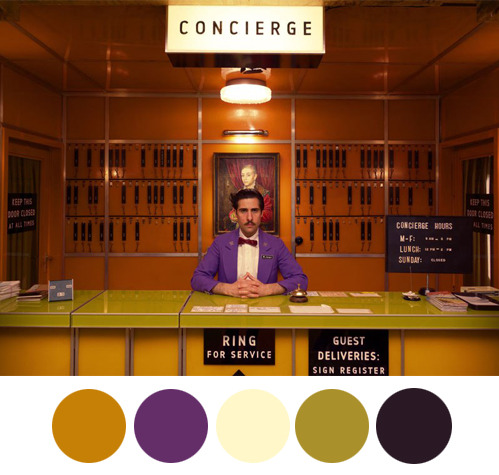
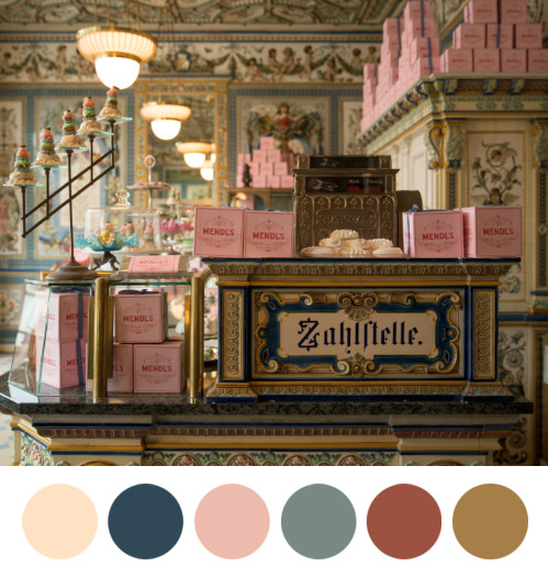
In this short film, the video maker Andrés Peña picked up some frames from The Grand Budapest Hotel, The Royal Tenenbaums, and Moonrise Kingdom films and broke them up into their color palettes.
And if this is not enough, take a look at this fun collection: Wes Anderson palettes
If the topic passionate you this is a twitter account with color palettes from most famous films.